Some COVID-19 plots for Southeast Asian countries
Recently, I found a GitHub repo containing a global COVID-19 dataset. I thought, why not try to do some plotting for Southeast Asian countries. So, I downloaded the data and limited the data to Southeast Asian countries only (Brunei, Indonesia, Malaysia, Philippines, Singapore, Thailand and Vietnam). I have uploaded this restricted data to my GitHub repo.
We are not going to do anything fancy, just some visualisations.
Let’s begin by reading the data.
library(tidyverse)
covid_sea <- read_csv("https://raw.githubusercontent.com/tengku-hanis/data-owid-covid/main/covid_sea.csv")
We are going to compare between each Southeast Asian countries in terms of:
- Daily cases
- Daily deaths
- Daily tests
- Daily vaccinations
Before that, we need to make a function, as all the above items have a generic things to plot with the exception on y axis.
easy_plot <- function(var1, lab_title, yaxis_lab, span = 0.14){
  covid_sea %>%
    select(date, location, {{var1}}) %>%
    drop_na() %>%
    ggplot(aes(date, {{var1}}, color = location)) +
    geom_smooth(se = F, span = 0.14) +
    geom_point(aes(color = location), alpha = 0.2) +
    geom_line(aes(color = location), alpha = 0.2, linetype = "dashed") +
    labs(title = {{lab_title}}) +
    ylab({{yaxis_lab}}) +
    xlab("Date") +
    theme_minimal()
}
var1 is going to be the item/variable that we want to compare, lab_title is the plot title, yaxis_lab is the label on the y axis, and span is just how smooth our smoothen line should be.
Daily cases
easy_plot(new_cases, "Daily cases for southeast Asian countries", "Daily cases", span = 0.8)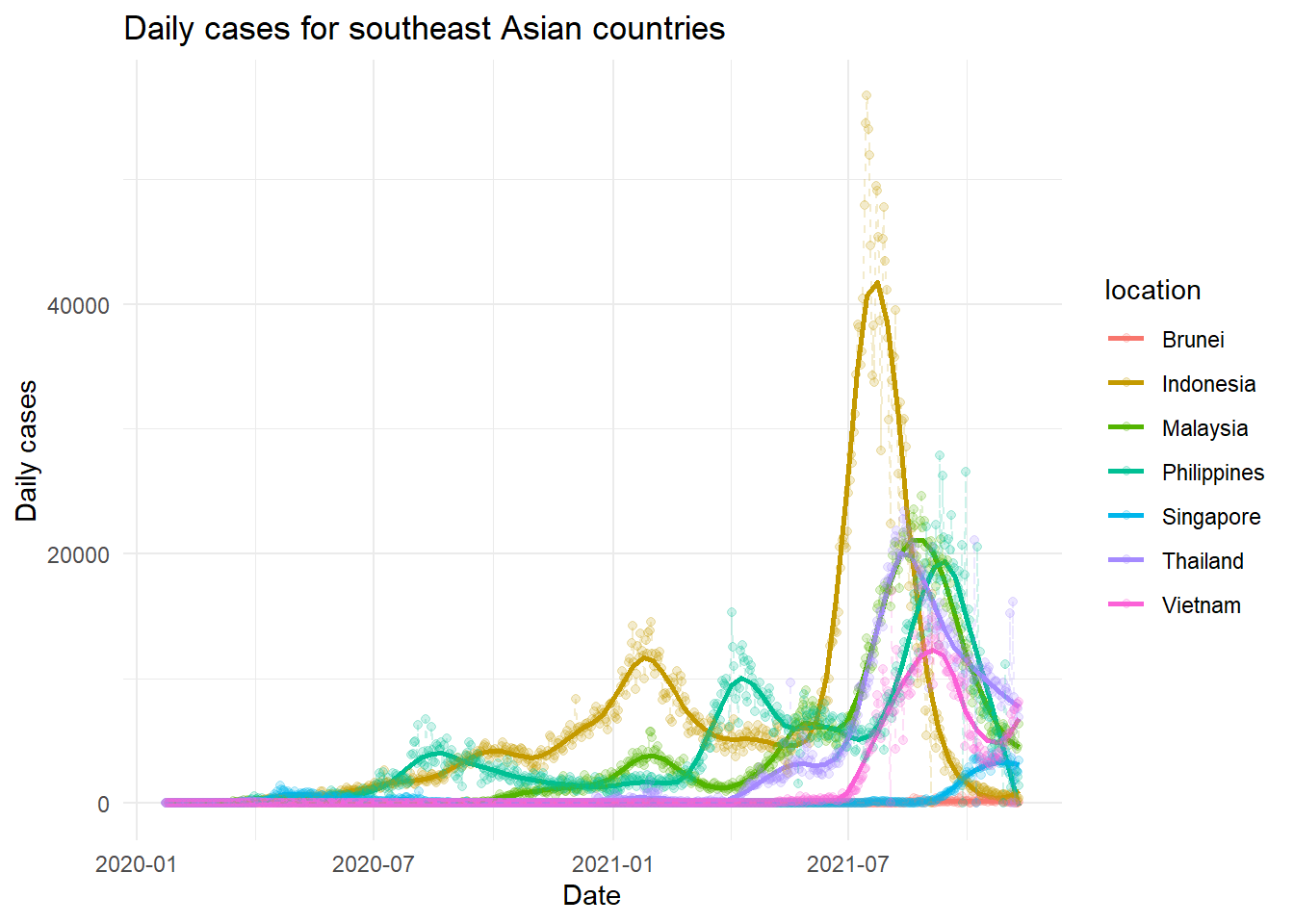
We cannot compare in terms of the frequency as big countries like Indonesia is expected to had a higher number of daily cases. A smoothen line though very basic, may indicate a simple trend. Thailand, Malaysia, Philippines and Indonesia seems to had a decreasing trend of cases. On the other hand, the daily cases in Vietnam seems to start to increase. Singapore had a more stabilised trend of cases, though a higher number of cases was observed in the latest period. Lastly, Brunei had too little cases, for us to see any sort of trend at the scale of the between countries comparison.
Daily deaths
easy_plot(new_deaths, "Daily deaths for southeast Asian countries", "Daily deaths", span = 0.8)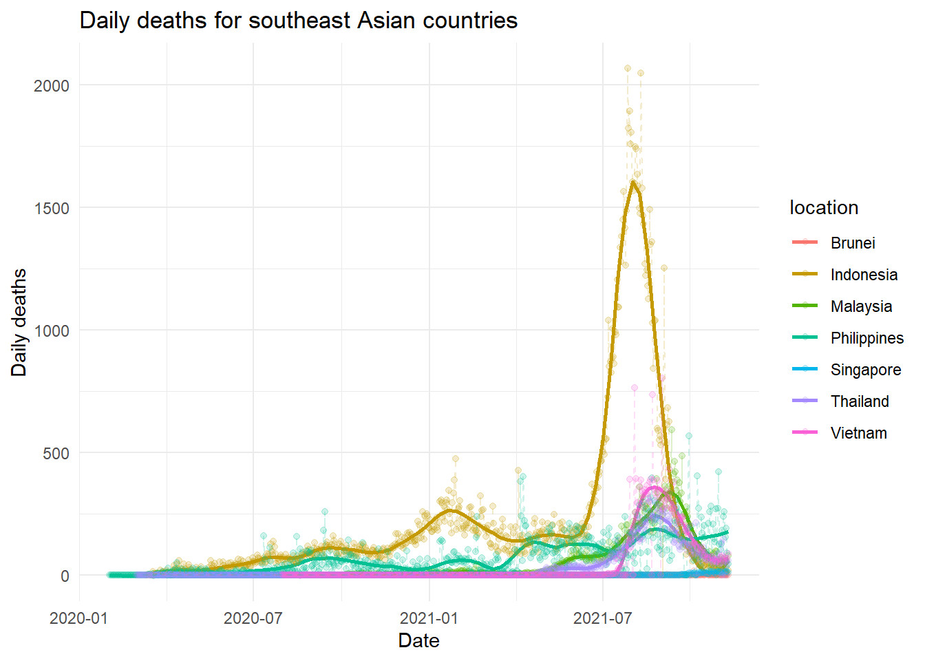
Philippines and Indonesia seems started to had a bit of increasing trend. Other countries look okay.
Daily tests
easy_plot(new_tests, "Daily tests for southeast Asian countries", "Daily tests", span = 0.2)
The daily tests plot looks a bit weird for Vietnam. Actually, the daily tests below zero are not avaliable (not sure if there is no test done in the period or the values is just missing). Hence, the weird looking plot for Vietnam. Data for Brunei and Thailand are not available. Malaysia seems to be quite aggressive in COVID-19 testing, even on par with Indonesia. Also, Vietnam seems to be very aggressive in the latest period, probably to cover the lack of COVID-19 testing previously.
Daily vaccinations
easy_plot(new_vaccinations, "Daily vaccinations for southeast Asian countries", "Daily vaccinations", span = 0.9)
Malaysia and Singapore had quite a similar distribution. Vietnam, Philippines, Thailand and Indonesia quite similar in which they had a series of wave in the rate of vaccinations, though the trend of wave for Thailand is less obvious. Again, the number in Brunei was too little for us to see any trend or distribution at this scale.
Malaysia situation
Let’s do a plot, specific to Malaysia. We going to scale the numbers, so that we able to see a comparison in term of trend or distribution.
covid_sea %>%
  filter(location == "Malaysia") %>%
  mutate(new_cases = scale(new_cases),
         new_deaths = scale(new_deaths),
         new_tests = scale(new_tests),
         new_vaccinations = scale(new_vaccinations)) %>%
  ggplot(aes(date)) +
  geom_line(aes(y = new_cases, color = "new_cases"), alpha = 0.3) +
  geom_line(aes(y = new_deaths, color = "new_deaths"), alpha = 0.3) +
  geom_line(aes(y = new_tests, color = "new_tests"), alpha = 0.3) +
  geom_line(aes(y = new_vaccinations, color = "new_vaccinations"), alpha = 0.3) +
  geom_point(aes(y = new_cases, color = "new_cases"), alpha = 0.3) +
  geom_point(aes(y = new_deaths, color = "new_deaths"), alpha = 0.3) +
  geom_point(aes(y = new_tests, color = "new_tests"), alpha = 0.3) +
  geom_point(aes(y = new_vaccinations, color = "new_vaccinations"), alpha = 0.3) +
  geom_smooth(aes(y = new_cases, color = "new_cases"), se = F, span = 0.3) +
  geom_smooth(aes(y = new_deaths, color = "new_deaths"), se = F, span = 0.3) +
  geom_smooth(aes(y = new_tests, color = "new_tests"), se = F, span = 0.3) +
  geom_smooth(aes(y = new_vaccinations, color = "new_vaccinations"), se = F, span = 0.6) +
  labs(title = "Situation in Malaysia") +
  ylab("Scaled Frequency") +
  xlab("Date") +
  guides(color = guide_legend("Items")) +
  scale_color_discrete(labels = c("Daily cases", "Daily deaths", "Daily tests", "Daily vaccinations")) +
  theme_minimal()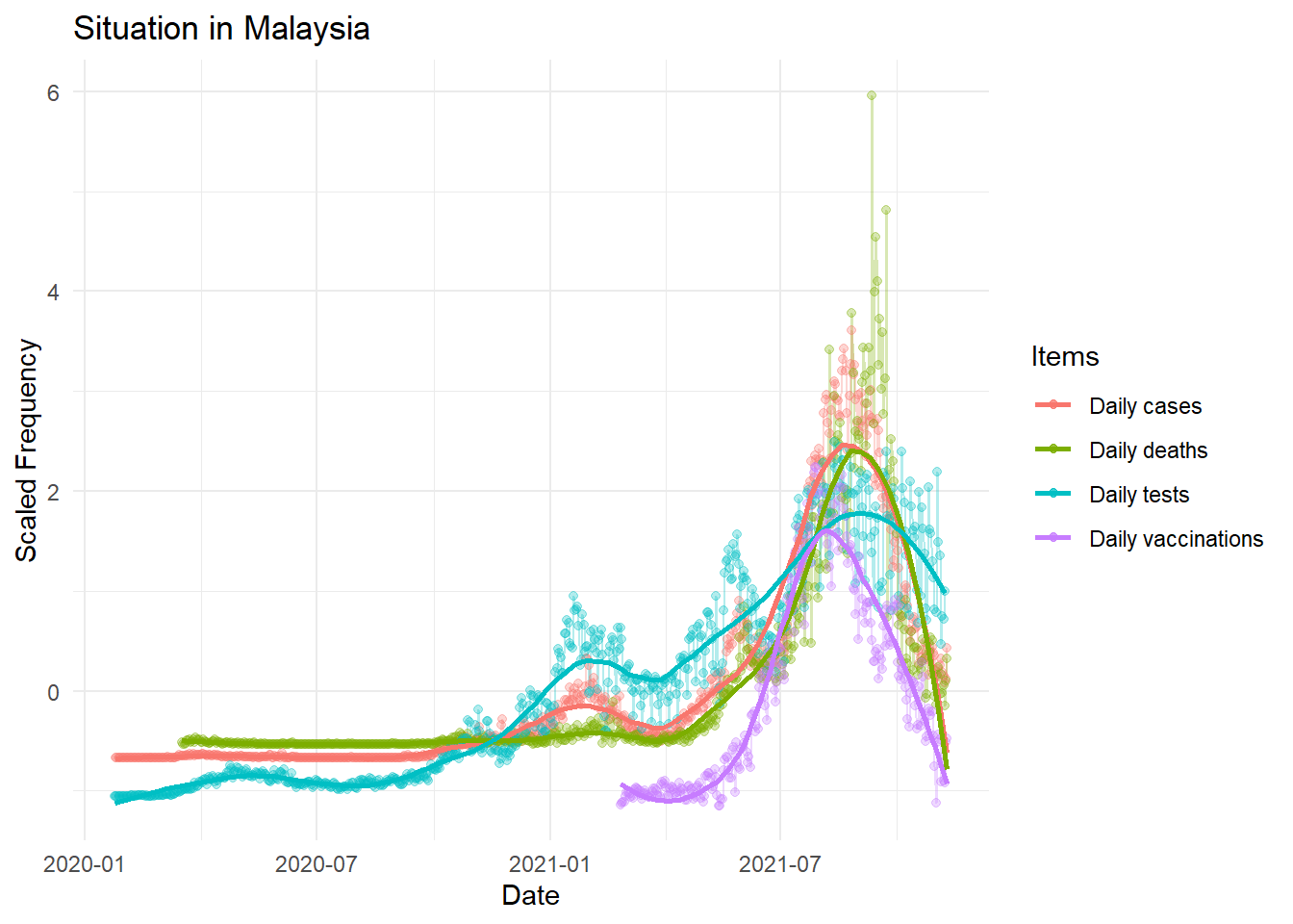
Interestingly, as the number of vaccination increased up to a certain threshold, the number of daily cases and daily deaths started to decreased. Obviously, the daily testing also decreased as in Malaysia, COVID-19 testing is done based on suspected cases and their persons of contact instead of mass testing.
Disclaimer: Please take anything written here with a massive grain of salt.
Data source: https://github.com/owid/covid-19-data/tree/master/public/data
Tengku Muhammad Hanis
Lead academic trainer
My research interests include medical statistics and machine learning application.