Explore data using PCA
Principal component analysis (PCA)
PCA is a dimension reduction techniques. So, if we have a large number of predictors, instead of using all the predictors for modelling or other analysis, we can compressed all the information from the variables and create a new set of variables. This new set of variables are known as components or principal component (PC). So, now we have a smaller number of variables which contain the information from the original variables.
PCA usually used for a dataset with a large features or predictors like genomic data. Additionally, PCA is a good pre-processing option if you have a correlated variable or have a multicollinearity issue in the model. Also, we can use PCA for exploration of the data and have a better understanding of our data.
For those who want to study the theoretical side of PCA can further read on this link. We going to focus more on the coding part in the machine learning framework (using tidymodels package) in this post.
Example in R
These are the packages that we going to use.
library(tidymodels)
library(tidyverse)
library(mlbench) #data
We going to use diabetes dataset. The outcome is binary; positive = diabetes and negative = non-diabetes/healthy. All other variables are numerical values.
data("PimaIndiansDiabetes")
glimpse(PimaIndiansDiabetes)
## Rows: 768
## Columns: 9
## $ pregnant <dbl> 6, 1, 8, 1, 0, 5, 3, 10, 2, 8, 4, 10, 10, 1, 5, 7, 0, 7, 1, 1~
## $ glucose <dbl> 148, 85, 183, 89, 137, 116, 78, 115, 197, 125, 110, 168, 139,~
## $ pressure <dbl> 72, 66, 64, 66, 40, 74, 50, 0, 70, 96, 92, 74, 80, 60, 72, 0,~
## $ triceps <dbl> 35, 29, 0, 23, 35, 0, 32, 0, 45, 0, 0, 0, 0, 23, 19, 0, 47, 0~
## $ insulin <dbl> 0, 0, 0, 94, 168, 0, 88, 0, 543, 0, 0, 0, 0, 846, 175, 0, 230~
## $ mass <dbl> 33.6, 26.6, 23.3, 28.1, 43.1, 25.6, 31.0, 35.3, 30.5, 0.0, 37~
## $ pedigree <dbl> 0.627, 0.351, 0.672, 0.167, 2.288, 0.201, 0.248, 0.134, 0.158~
## $ age <dbl> 50, 31, 32, 21, 33, 30, 26, 29, 53, 54, 30, 34, 57, 59, 51, 3~
## $ diabetes <fct> pos, neg, pos, neg, pos, neg, pos, neg, pos, pos, neg, pos, n~We going to split the data and extract the training dataset. We going to explore only the training set since we going to do this in a machine learning framework.
set.seed(1)

ind <- initial_split(PimaIndiansDiabetes)
dat_train <- training(ind)
We create a recipe and apply normalization and PCA techniques. Then, we prep it.
# Recipe
pca_rec <-
  recipe(diabetes ~ ., data = dat_train) %>%
  step_normalize(all_numeric_predictors()) %>%
  step_pca(all_numeric_predictors())

# Prep
pca_prep <- prep(pca_rec)
So, we can extract the PCA data using tidy(). type = "coef" indicates that we want the loadings values. So, the values in the data are the loadings.
pca_tidied <- tidy(pca_prep, 2, type = "coef")
pca_tidied
## # A tibble: 64 x 4
## terms value component id
## <chr> <dbl> <chr> <chr>
## 1 pregnant 0.107 PC1 pca_JtuLZ
## 2 glucose 0.357 PC1 pca_JtuLZ
## 3 pressure 0.330 PC1 pca_JtuLZ
## 4 triceps 0.460 PC1 pca_JtuLZ
## 5 insulin 0.466 PC1 pca_JtuLZ
## 6 mass 0.447 PC1 pca_JtuLZ
## 7 pedigree 0.315 PC1 pca_JtuLZ
## 8 age 0.158 PC1 pca_JtuLZ
## 9 pregnant -0.597 PC2 pca_JtuLZ
## 10 glucose -0.192 PC2 pca_JtuLZ
## # ... with 54 more rowsSo, basically the loadings indicate how much each variable contributes to each component (PC). A large loading (positive or negative) indicates a strong relationship between the variables and the related components. The sign indicates a negative or positive correlation between the variables and components.
We can further visualise these loadings.
pca_tidied %>%
  ggplot(aes(value, terms, fill = terms)) +
  geom_col(show.legend = F) +
  facet_wrap(~ component) +
  ylab("") +
  xlab("Loadings") +
  theme_minimal()
Besides the loadings, we can also get a variance information. Variance of each component (or PC) measures how much that particular component explains the variability in the data. For example, PC1 explain 26.2% variance in the data.
pca_tidied2 <- tidy(pca_prep, 2, type = "variance")

pca_tidied2 %>%
  pivot_wider(names_from = component, values_from = value, names_prefix = "PC") %>%
  select(-id) %>%
  mutate_if(is.numeric, round, digits = 1) %>%
kableExtra::kable("simple")| terms | PC1 | PC2 | PC3 | PC4 | PC5 | PC6 | PC7 | PC8 |
|---|---|---|---|---|---|---|---|---|
| variance | 2.1 | 1.7 | 1.0 | 0.8 | 0.8 | 0.7 | 0.5 | 0.4 |
| cumulative variance | 2.1 | 3.8 | 4.9 | 5.7 | 6.5 | 7.2 | 7.6 | 8.0 |
| percent variance | 26.2 | 21.5 | 12.9 | 10.6 | 9.9 | 8.5 | 5.7 | 4.7 |
| cumulative percent variance | 26.2 | 47.7 | 60.7 | 71.2 | 81.1 | 89.6 | 95.3 | 100.0 |
Next, we can visualise PC1 and PC2 in a scatter plot and see how each variable influences both PCs. First, we need to extract the loadings and convert into a wide format for our arrow coordinate in the scatter plot.
pca_tidied3 <-
  pca_tidied %>%
  filter(component %in% c("PC1", "PC2")) %>%
  select(-id) %>%
  pivot_wider(names_from = component, values_from = value)
pca_tidied3
## # A tibble: 8 x 3
## terms PC1 PC2
## <chr> <dbl> <dbl>
## 1 pregnant 0.107 -0.597
## 2 glucose 0.357 -0.192
## 3 pressure 0.330 -0.234
## 4 triceps 0.460 0.279
## 5 insulin 0.466 0.200
## 6 mass 0.447 0.121
## 7 pedigree 0.315 0.110
## 8 age 0.158 -0.638Now, we can make a scatter plot using training set data (juice(pca_prep)) and the loadings data (pca_tidied3). Also, we going to add percentage of variance for PC1 and PC2 in the axis labels.
juice(pca_prep) %>%
  ggplot(aes(PC1, PC2)) +
  geom_point(aes(color = diabetes, shape = diabetes), size = 2, alpha = 0.6) +
  geom_segment(data = pca_tidied3,
               aes(x = 0, y = 0, xend = PC1 * 5, yend = PC2 * 5),
               arrow = arrow(length = unit(1/2, "picas")),
               color = "blue") +
  annotate("text",
           x = pca_tidied3$PC1 * 5.2,
           y = pca_tidied3$PC2 * 5.2,
           label = pca_tidied3$terms) +
  theme_minimal() +
  xlab("PC1 (26.2%)") +
ylab("PC2 (21.5%)") 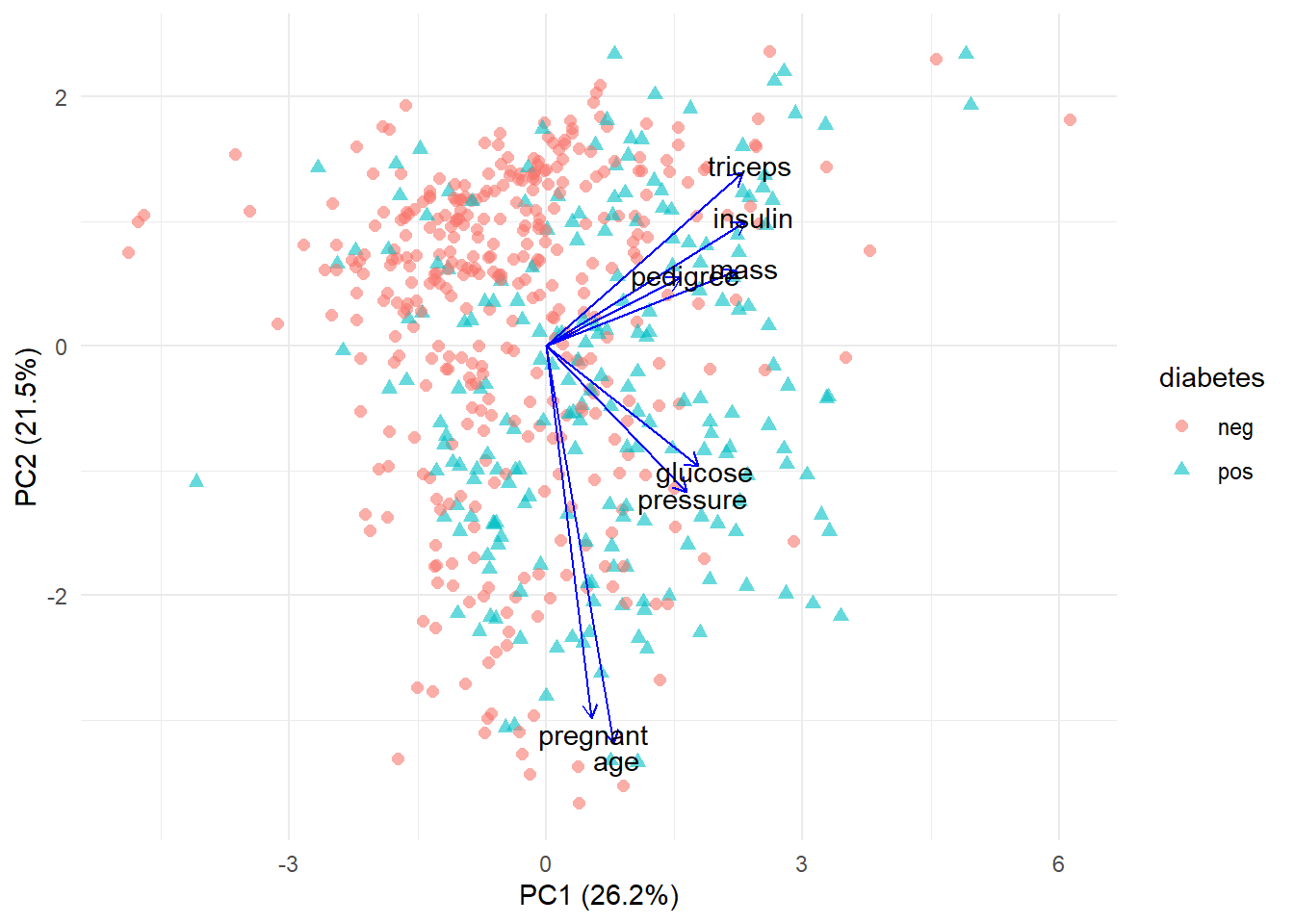
So, from this scatter plot we learn that:
- (triceps, insulin, pedigree and mass), (glucose and pressure) and (pregnant and age) are correlated as their lines are close to each other
- As PC1 and PC2 increase, triceps, insulin, pedigree and mass also increase
- As PC2 decreases, pregnant and age increase
References:
Tengku Muhammad Hanis
Lead academic trainer
My research interests include medical statistics and machine learning application.