Basic plotting with Matplotlib and Seaborn
This post is continuation of my previous post about Python. For those interested:
- Basic data wrangling with Python
- Basic plotting with matplotlib and seaborn
- Comparison of ggplot in R versus in Python
There are several packages or libraries available in Python for plotting and visualization. However, the most commonly used package is matplotlib. This package is quite extensive and often time can be quite complicated to use. Thus, seaborn package is another alternative and complementary to matplotlib. Seaborn is based on matplotlib and provides a high-level functionality compare to matplotlib.
So, in this blog post, let us compare several basic plots using both packages.
Load packages
import matplotlib.pyplot as plt
import seaborn as sns
import pandas as pd
Load dataset
We going to use the iris dataset.
dat = sns.load_dataset('iris')We can further see the information on this dataset.
dat.head(5)## sepal_length sepal_width petal_length petal_width species
## 0 5.1 3.5 1.4 0.2 setosa
## 1 4.9 3.0 1.4 0.2 setosa
## 2 4.7 3.2 1.3 0.2 setosa
## 3 4.6 3.1 1.5 0.2 setosa
## 4 5.0 3.6 1.4 0.2 setosaHistogram
Let’s plot the histogram using matplotlib first.
plt.hist(dat['sepal_length'], bins=30)
plt.show()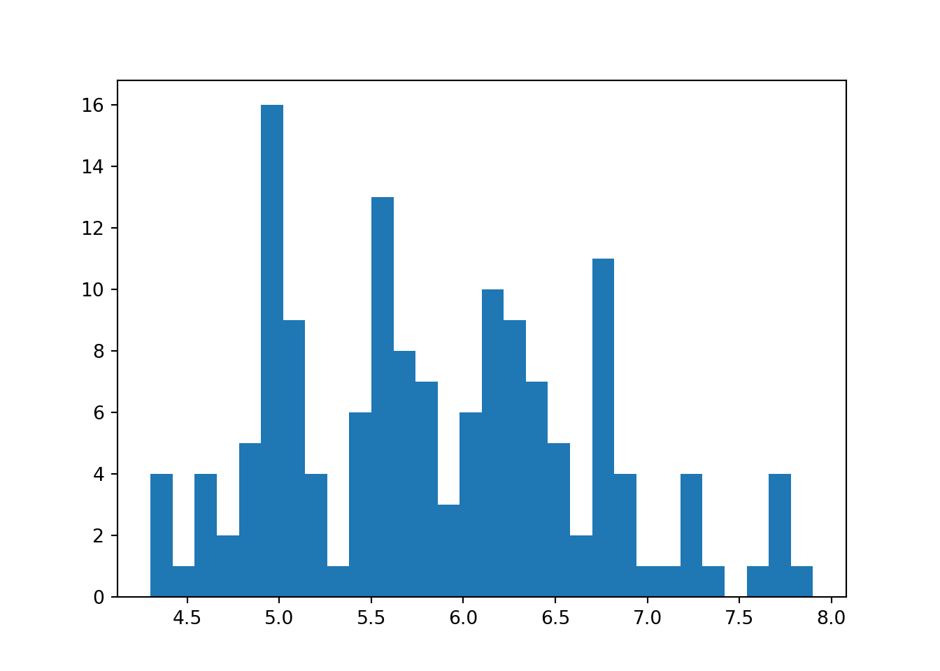
Notice that this histogram does not has any label. So, to add a label, we need to do this manually.
plt.hist(dat['sepal_length'], bins=30)
plt.xlabel('Sepal length') #x-axis label
plt.ylabel('Frequency') #y-axis label
plt.show()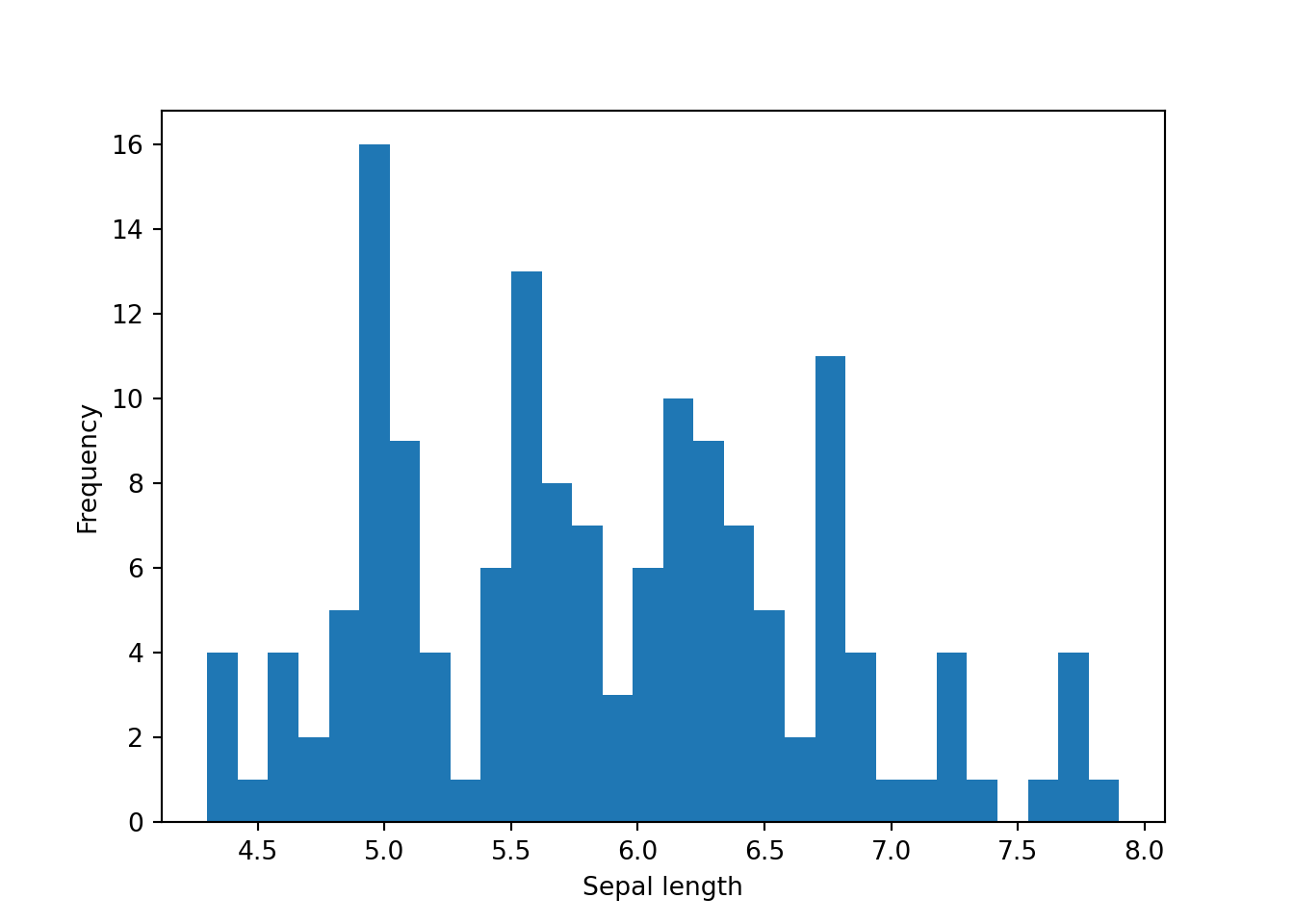
However, using seaborn, the label is extracted from the variable name, which is pretty convenient.
sns.histplot(dat['sepal_length'], bins=30)
plt.show()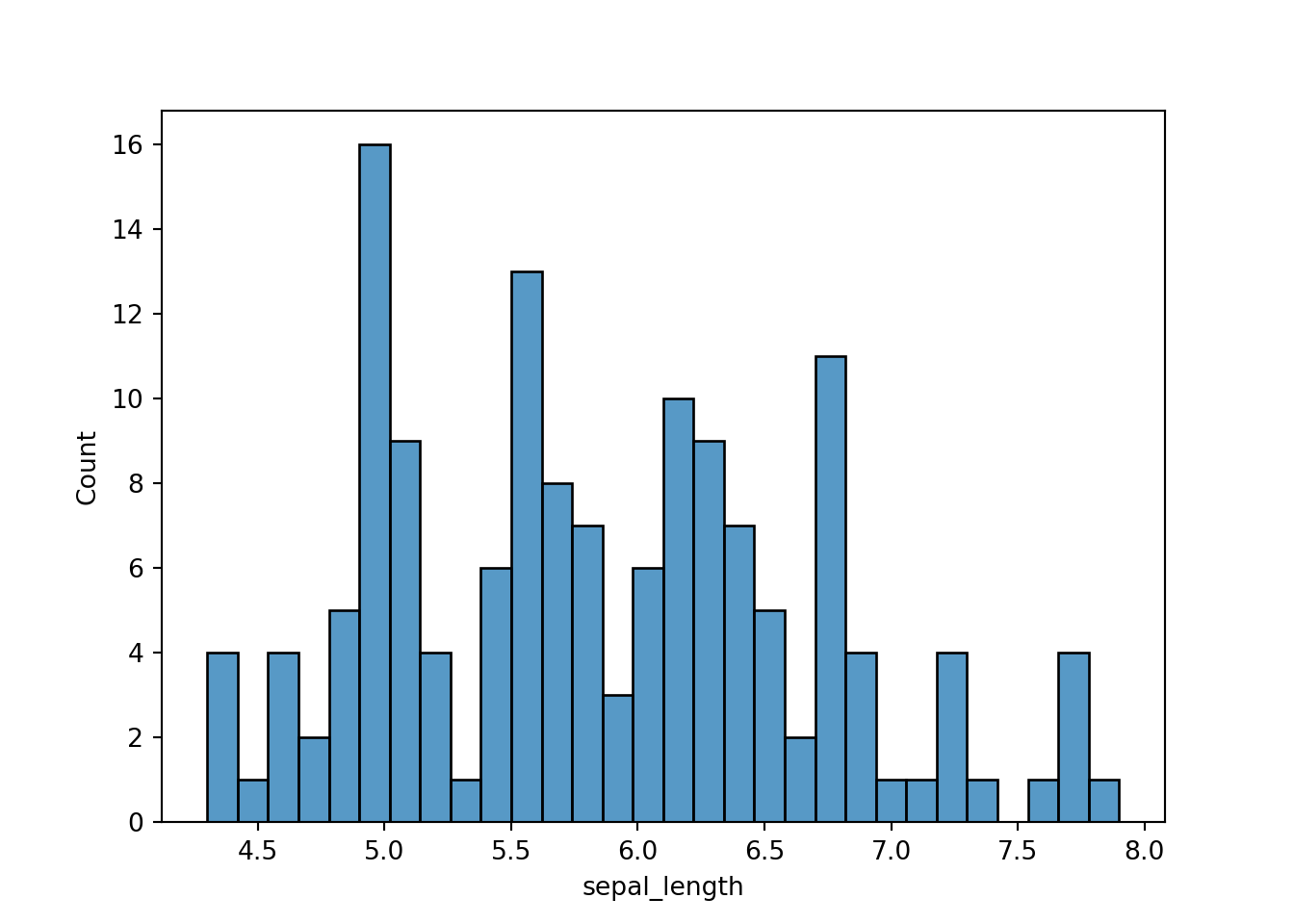
Let’s say we want to plot the histogram according to different levels.
species = ['setosa', 'versicolor', 'virginica']

for i in species:
    subset = dat[dat['species'] == i]
    plt.hist(subset['sepal_length'], label = i)

plt.legend(loc = 'upper right')
plt.xlabel('Sepal length')
plt.ylabel('Frequency')
plt.show()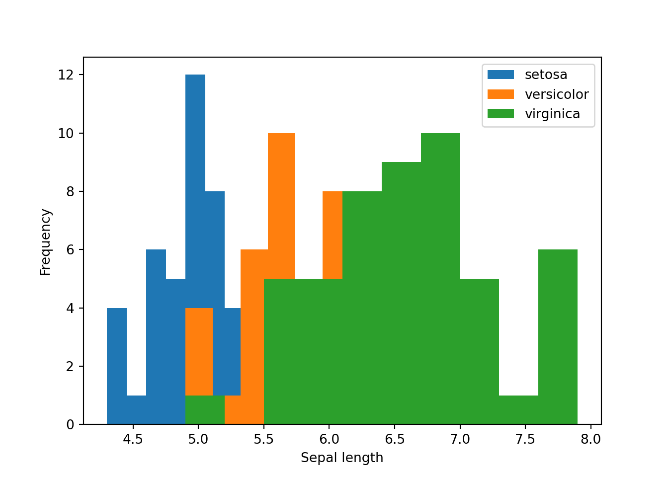
The codes above are quite long. In seaborn, the histogram above can be generated quite easily.
sns.histplot(x = 'sepal_length', hue = 'species', data = dat)
plt.show()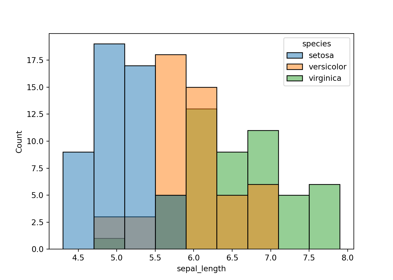
Boxplot
First, let’s do boxplot using matplotlib.
bp = plt.boxplot(dat['sepal_length'])
plt.xlabel('Sepal length')
plt.show()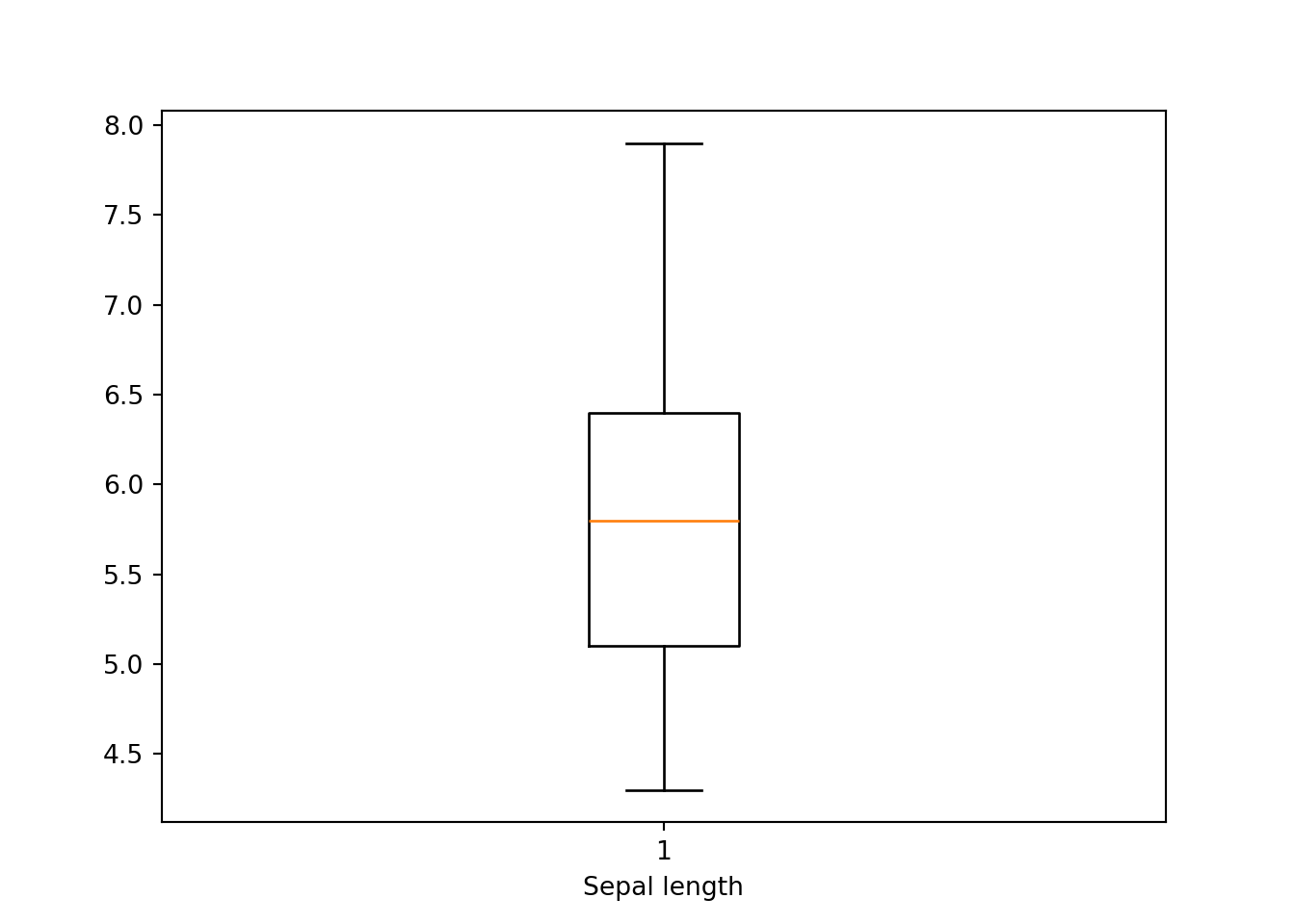
If we wanto to do boxplot according to other variable. The codes become a bit complicated especially for beginners.
species = dat.groupby('species')
setosa = species.get_group('setosa')['sepal_length']
versicolor = species.get_group('versicolor')['sepal_length']
virginica = species.get_group('virginica')['sepal_length']

bp = plt.boxplot([setosa, versicolor, virginica], labels = ['setosa', 'versicolor', 'virginica'])
plt.xlabel('Sepal length')
plt.show()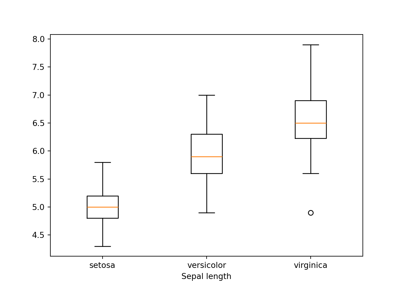
Both plots above are quite easy to do in seaborn. Below are the codes for the basic histogram.
sns.boxplot(dat['sepal_length'])
plt.show()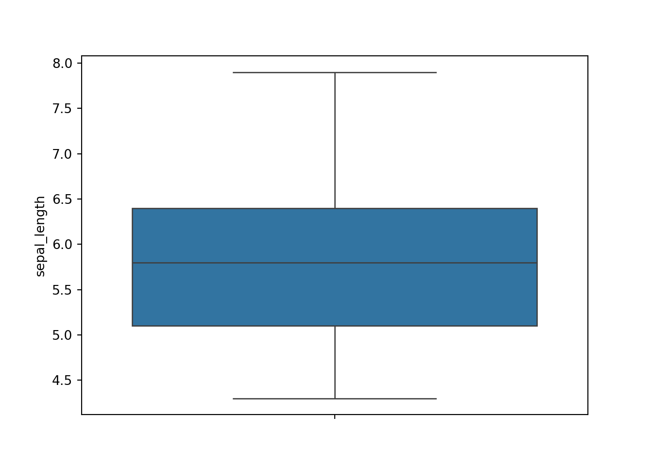
Next, to plot sepal_length based on species is pretty much straightforward in seaborn.
sns.boxplot(y='sepal_length', hue='species', data=dat)
plt.show()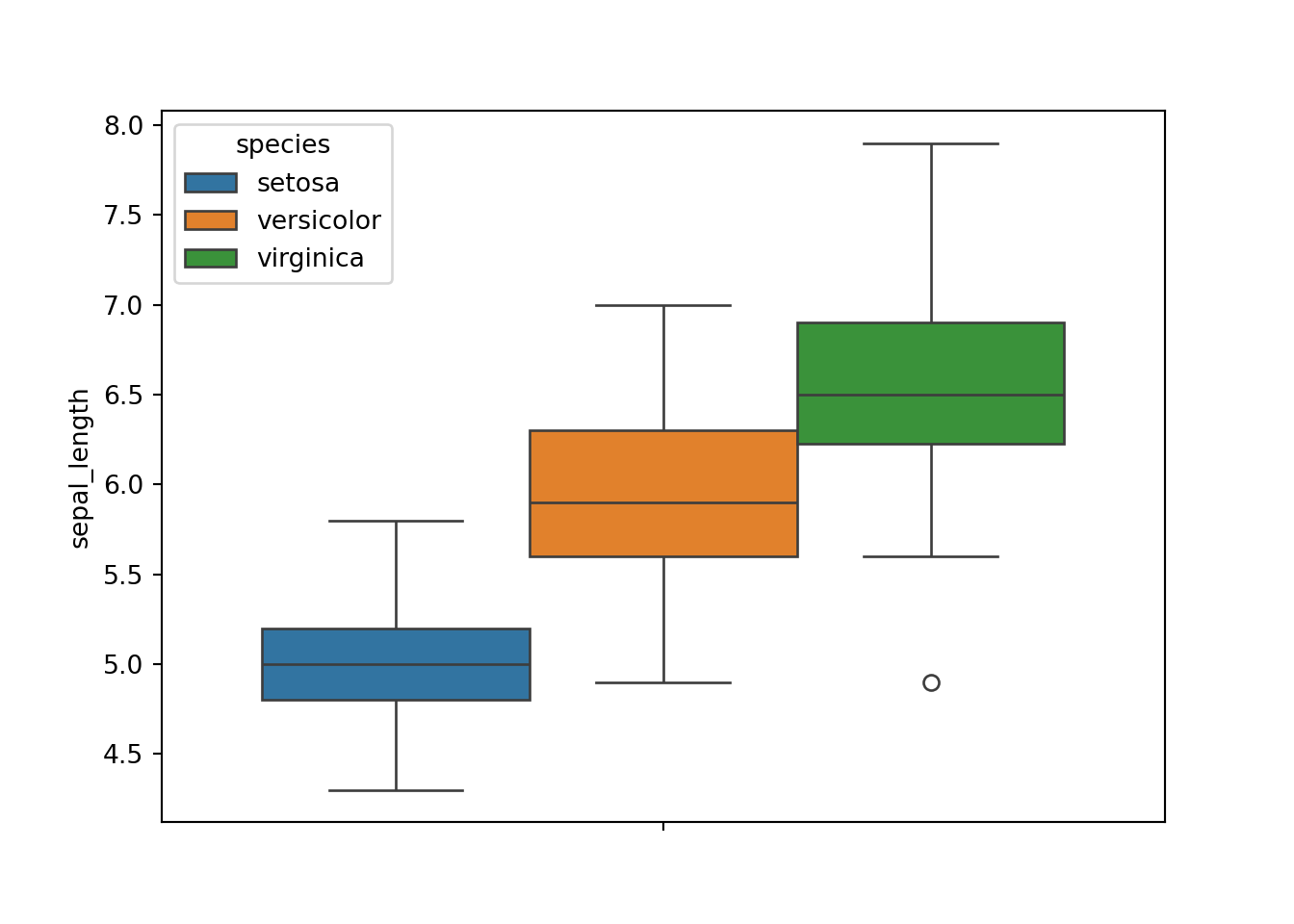
Scatter plot
Lastly, let’s see the scatter plot using matplotlib.
plt.scatter(x=dat['sepal_length'], y=dat['sepal_width'])
plt.xlabel('Sepal length')
plt.ylabel('Sepal width')
plt.show()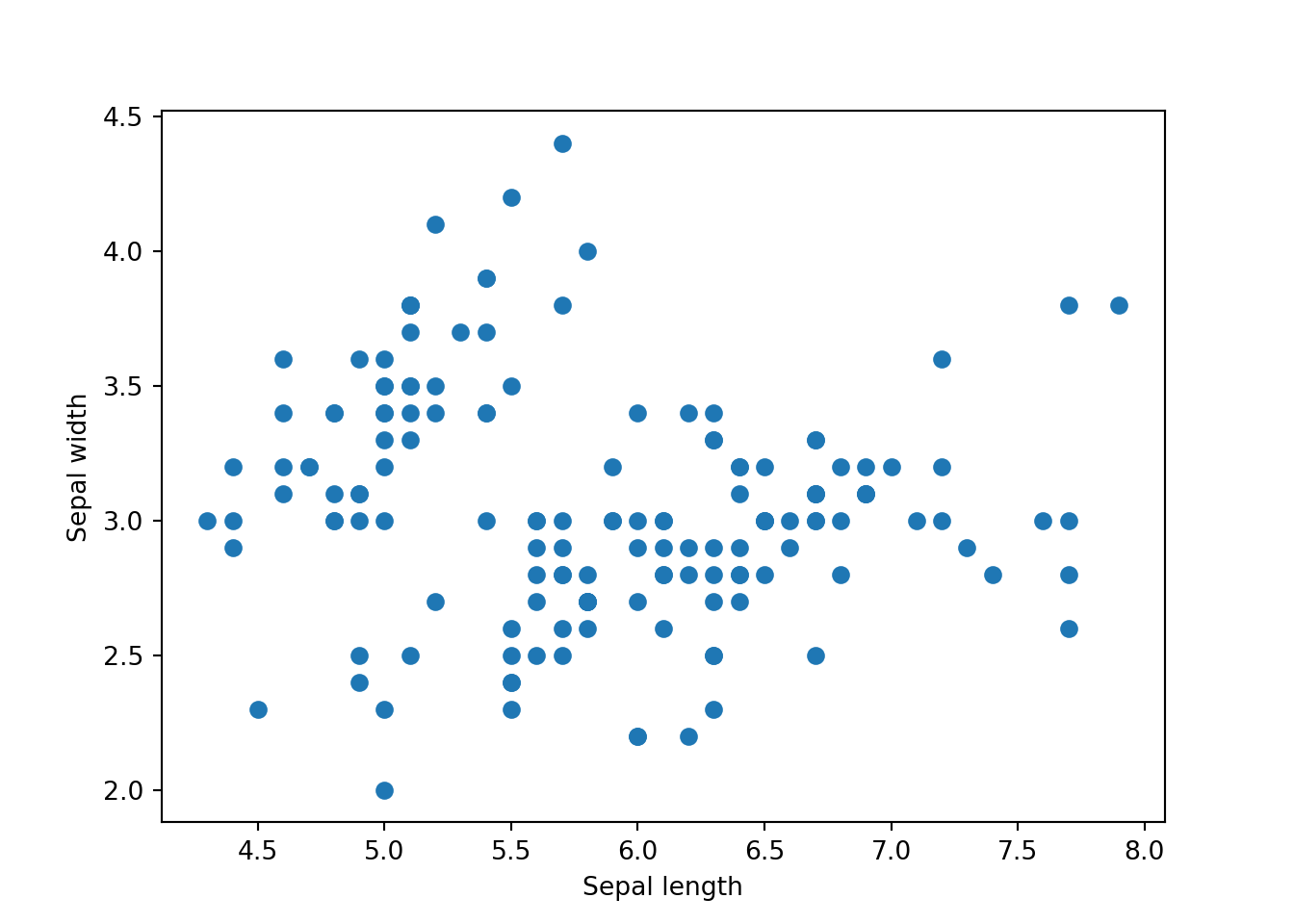
We can further extend this plot by categorising it into different species.
# Define the species to colors mapping
species_to_color = {'setosa': 'blue', 'versicolor': 'green', 'virginica': 'red'}
colors = dat['species'].map(species_to_color)

# Create the scatter plot
plt.scatter(x=dat['sepal_length'], y=dat['sepal_width'], c=colors)
plt.xlabel('Sepal length')
plt.ylabel('Sepal width')
plt.legend(handles=[plt.Line2D([0], [0], marker='o', color='w', markerfacecolor=color, markersize=10, label=species) for species, color in species_to_color.items()], title='Species')
plt.show()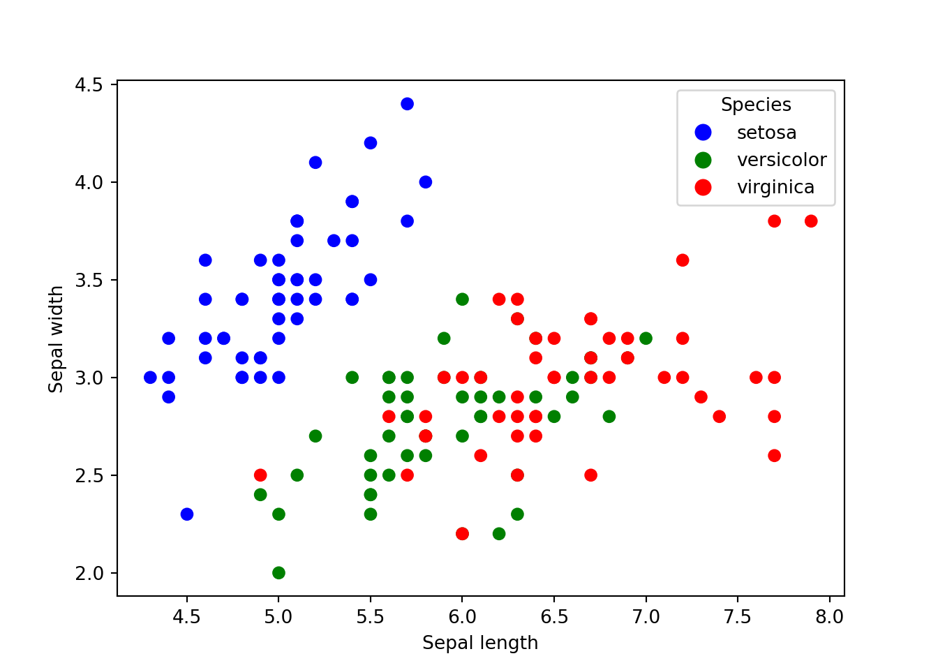
Now, let’s see the seaborn package. This is the basic scatter plot.
sns.scatterplot(x='sepal_length', y='sepal_width', data=dat)
plt.show()
To extend this plot by categorising it into different species in seaborn is actually quite simple.
sns.scatterplot(x='sepal_length', y='sepal_width', hue='species', data=dat)
plt.show()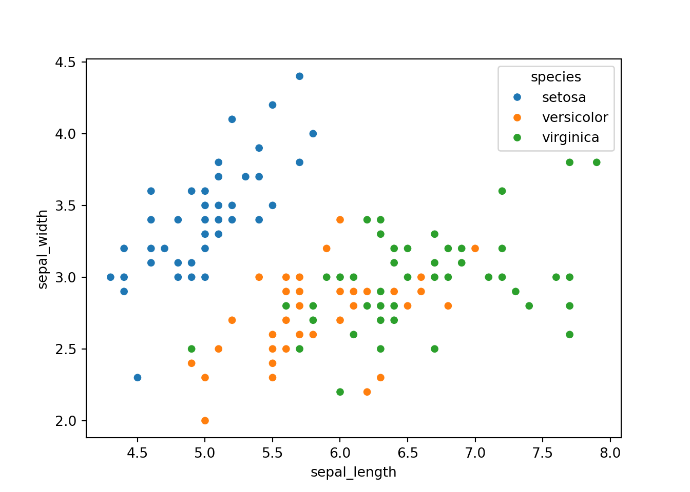
Conclusion
In conclusion, matplotlib and seaborn complement each other well. Seaborn is an excellent choice for quick and standard plots, thanks to its high-level interface. On the other hand, matplotlib offers a more extensive range of customization options and is ideal for creating complex and detailed visualizations. Ultimately, choosing between matplotlib and seaborn depends on the specific requirements of the visualization task.
Tengku Muhammad Hanis
Lead academic trainer
My research interests include medical statistics and machine learning application.