Visualising augmented images in Keras
Data augmentation
Data augmentation is been used in deep learning for many reasons. One of the reason is to reduce overfitting and makes the model more robust. Data augmentation can be done relatively easy in keras package in R. However, I have not found any resources on how to visualise the augmented image in R except in Python. Visualising the augmented image can be quite useful to get an idea of how the image looks like. So, this post covers a simple to do this in R.
R code
Let’s load the keras library
library(keras)## Warning: package 'keras' was built under R version 4.2.2Next, we load the image from the internet.
r_logo <-
  get_file("img", "https://ih1.redbubble.net/image.522493300.6771/st,small,507x507-pad,600x600,f8f8f8.jpg") %>%
  image_load()
Our image right now is 600x 600 x 3. The 3 at the back because the image is coloured (RGB channels).
r_logo$size## [[1]]
## [1] 600
##
## [[2]]
## [1] 600So, we need to change the image into an array with the dimension of 1 x 600 x 600 x 3. The number 1 indicates we have only one image.
r_logo <-
  r_logo %>%
  image_to_array() %>%
  array_reshape(c(1, dim(.)))
dim(r_logo)
## [1] 1 600 600 3Once we have a correct dimension, we can specify the parameters for the data augmentation.
augment_params <- image_data_generator(horizontal_flip = T,
                                       vertical_flip = T,
                                       rotation_range = 0.5,
                                       zoom_range = 0.5,
                                       fill_mode = "reflect")
I am not going to into the details of the parameters. For those interested, the TensorFlow for R website explain this very well.
Next, we can generate the batch of augmented data at random. This function, however, will only run once we fit the model.
img_gen <- flow_images_from_data(r_logo,
                                 generator = augment_params,
                                 batch_size = 1)
Finally, we can plot the image. Firstly, this is our original image.
img_gen$x [1,,,] %>%
  as.raster(max = 255) %>%
  as.array() %>%
  plot()
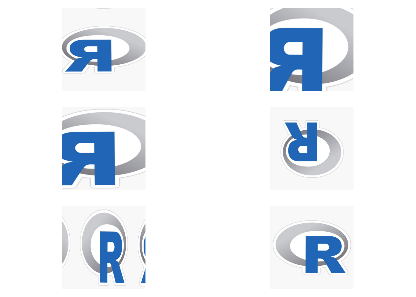
Now, we going to loop the augmentation process. Here, we going to generate six augmented images. The set.seed for reproducibility.
set.seed(123)
par(mfrow = c(3, 2), mar = c(1, 0, 1, 0))

for (i in 1:6) {
  IMG <- img_gen$`next`()
  IMG[1,,,] %>% as.raster(max = 255) %>% as.array() %>% plot()
}
Conclusion
I believe this is quite useful to get a sense of how your data is augmented. Consequently, this may help in selecting the parameters for the data augmentation.
Tengku Muhammad Hanis
Lead academic trainer
My research interests include medical statistics and machine learning application.